Before you start creating the chart, plan the lists to be included, grouping, filtering and totals. Use the steps below to create a chart.
- Open the Chart Center by clicking Reports > Chart Center.
.png)
- Next, select the report group the chart will be displayed in and click new chart.
- The Chart Wizard will display. You can navigate between tabs by using Previous and Next buttons at the bottom or by clicking the tab name at the top. Click Reset to clear all the current chart settings and start setting it up from scratch. Click the Submit button at any moment to save your progress and return to the Chart Center.
On the first step, specify the chart name and description.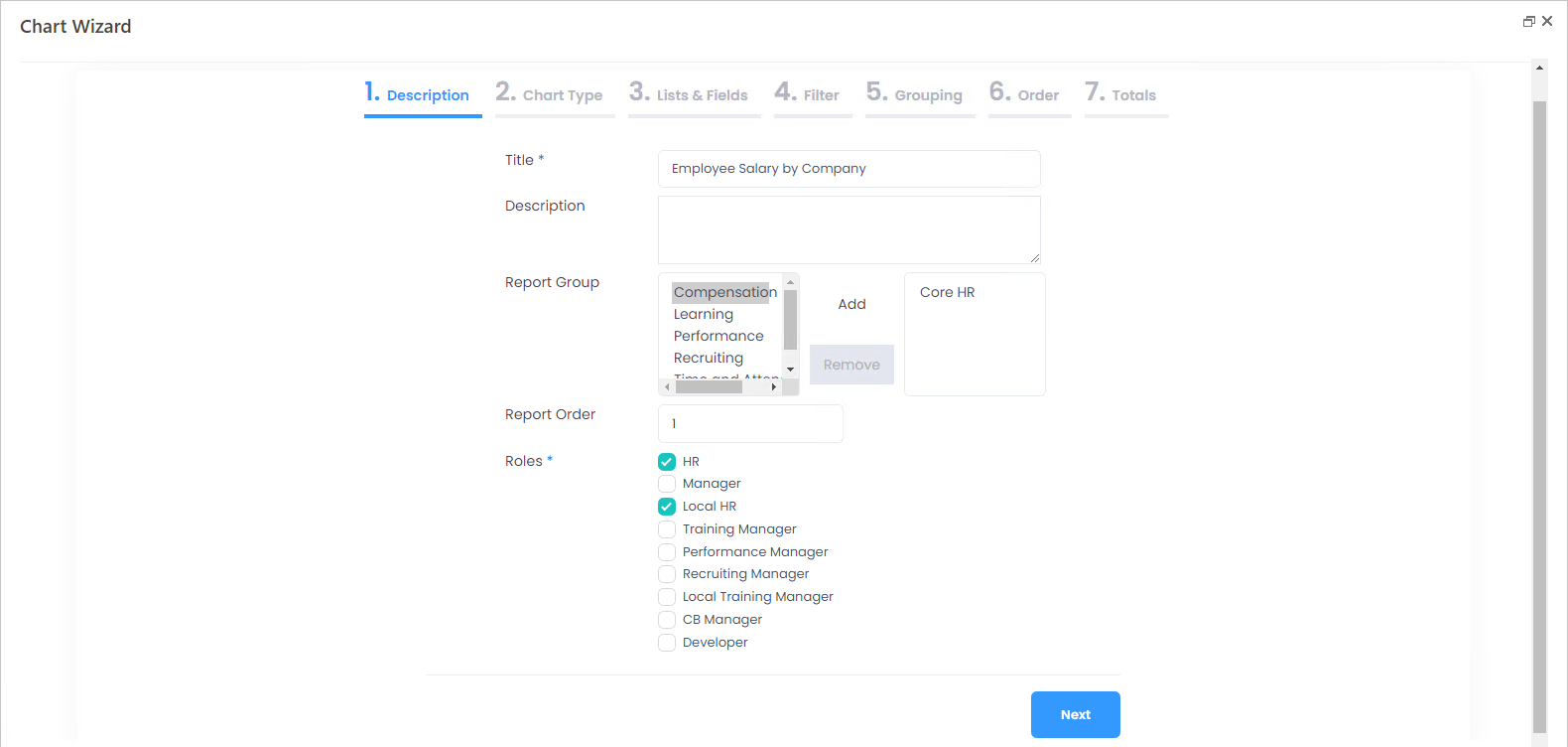
- If you clicked create chart from the report group the chart is to be displayed in, this group will be already selected in the Report Group field. Otherwise, use the Add and Remove to set the right group.
- In the Report Order field, specify the display order of the current chart within the report group. The charts with the empty Report Order will display in the alphabetic order.
- Select check boxes next to the Lanteria HR roles that will have access to the chart.
- Click Next to proceed to setting the chart type.
.png)
- In the Select type of the chart, select one of the following options:
- Area chart
- Bar chart
- Column chart
- Line chart
- Pie chart
- Radar area chart
- Radar line chart
- Use the Label Type field to specify how the chart totals will be displayed (whether it will be numeric, currency, percent etc).
- Next, choose whether the legend will be displayed on the chart and if yes, where it will be located (bottom, top, left or right).
- If the chart totals must be displayed ascending or descending, specify it in the Ordering field.
- Select the Colored check box to display the chart in the brighter colors. If the chart is to be displayed by default in the contrasted mode, click the
.png) sign.
sign..png)
- Select the Tooltip check box to have the tooltip displayed when pointing to the chart.
.png)
- Click Next to proceed to selecting lists for the chart.NotePlease note that after the first list is selected, only the lists related to it through lookups will be available for the second list selection.
- On the Lists and Fields tab, select the lists the chart data will be taken from. For example, we are creating the chart to view the employee salary by company, to be filtered by country, if required. In this case, we select the Employees list first
.png) and then the Employee Salary Details list, which is available for selection, since it has a lookup to the Employees.
and then the Employee Salary Details list, which is available for selection, since it has a lookup to the Employees. .png)
- Next, click Select Fields to specify which fields from each list will be used for the chart.
.png)
If we are creating the salary per company chart, we'll select Full Name, Company and Country (for filtering) from the Employees list and Annual Base Salary from the Employee Salary Details list..png)
- Click Next to proceed to setting up the filters.
- On the Filter tab, you can create filters to complement the standard Additional Filter available for the charts and reports if the Employees list is included into them. Click Add Filter next to the field you'll be using for filtering the chart. Click User defined values if the users will be able to select the filtering values manually and select the default value for the filter, if relevant. If the users won't be able to select the values, but the chart will be displayed for a specific filter only, click Predefined values and choose the value under Default value. Use this feature to display the chart for a specific country only etc.
.png)
- Click Next to proceed to the Grouping tab.NoteIt is mandatory to set up grouping for the chart.
- On the Grouping tab, click Add Group next to the field you'll be grouping the chart totals by. For example, we'll be grouping our salary per company chart by the Company field.
.png) NoteIf you are grouping by field of the Date and Time type, the users will be able to view data by Date, Month or Year.
NoteIf you are grouping by field of the Date and Time type, the users will be able to view data by Date, Month or Year. - Click Next to proceed to the Order tab and change the order in which fields are displayed in the chart legend, if required.
.png)
- Click Next and proceed to setting up the totals. NoteIt is mandatory to define the totals for the chart to function. After you finalize the Grouping step, the default total values are assigned to all the fields that do not participate in grouping. The default values are as follows: for the fields of the Number type it will be Sum, for Date it will be Max, for other types - Count. You can change the values as required.
- Specify for which field(s) the totals will be displayed and how they will be counted (Average, Sum, Count, Min, Max). For example, for the salary per company chart we'll have totals counted as sum for Annual Base Salary.
.png)
- Click Submit to finish creating the chart.
- Click the chart name in the Chart Center to run it.
.png)